I was hoping that this week’s blog would be showing a completed model, but alas things have conspired to delaying the finishing of this particular project, so it has unfortunately become yet another work in progress ! I was also hoping to get this blog out yesterday (I’m trying to make a Saturday my target posting day), but again real-life and she-who-must-be-obeyed held sway on that idea.
Some of you will no doubt recognise the signage of my Diner, being very similar to the free “Horseman’s Deli” (from “Microtactix” - http://www.microtactix.com/) that can be found on the internet. A bit of jiggery-pokery on Photoshop and the “Horsemans Deli” became the “Horsemans Diner”.
I always liked the look of this building but I wanted something a bit different from everyone else’s Deli; you have no further to look than Vampifan's rendition of the Deli to see what the original was intended to look like.
 |
| Parking is at a premium in these parts. |
The first photograph shows the general overall view of the diner with some of my latest vehicle acquisitions (picked up today for 10p each !). The overall footprint of the Diner is 9” x 9” (22.5cm x 22.5cm approx) , with a height of 3” (7.5cm) to the top of the rooftop parapet which is approximately ½” (1.25 cm) tall.
 |
| Notice the glaring mistake ? |
This photograph is merely a close-up of the front of the Diner, I had to redo the front doors and enlarge the door frames to make a better “hinge”; all the doors in the Diner are openable.
Notice that my photography skills haven't improved and I'm still getting glare on the windows.
 | |
| The boring back which needs trash cans posters etc. |
This picture is of the back of the Diner, nothing spectacular here, but note that the inside floor of the diner still has to be removed from the outside !
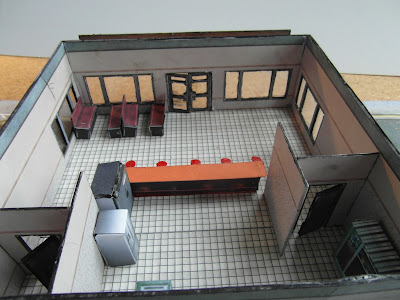
The next two views show the inside of the diner from the front. The fixtures and fittings in the model are only a temporary measure and aren’t glued in place or necessarily what will appear in the finished model. They’re there just to illustrate what the final product may look like, if and when I ever get it finished, most of the fittings are from World Works Games. I have posters, menus, tables, more benches and other fittings to put into the model, along with a couple of posters for the outside walls to bring the model to life so to speak.
 | |
| Overall view, the toilet is in the dark top right corner |
 | |
| Close up of counter, seating and kitchen |
The last two views are from the back of the diner, showing the kitchen area, nothing spectacular here.
 |
| I need twice the bench seating shown and tables ! |
 |
| Kitchen area, a few more fittings still needed here |
It may just be a WiP but it's a darned good WiP! I appreciate that the internal layout may change but I like what you have here. It just looks... right. Having made those front doors so that they can open and shut I know just how fiddly they and I applaud you on the work you've done on them. Many would have just left them in the closed position. It looks like you're adopting my motto of going the extra mile! You ought to be proud of this model, Joe, and I'm sure that once it is finished it'll be a jewel in the crown for you.
ReplyDeleteThanks Bryan, all encouragement truly appreciated.
DeleteGood work so far!
ReplyDeleteIt is certaintly ready to have a game with.
Thanks, two or three more buildings and I may even contemplate having a game !
DeleteI love the interior. Really nice. I should really make a list of all you guys' work so I can copy some of that, hehe.
ReplyDeleteAnd .10 a car, just great. Especially the casual two seem like a double bargain!
Tgabks Mathyoo, I'm always on the lookoout for cheap transport
DeleteLooking great so far 10p a car where from?
ReplyDeleteI got the vehicles from a monthly car boot sale in the centre where I work., I snapped up two articulated lorry cabs and a open back HGV too (all at 10p each !)
DeleteLucky boy!
Delete"boy"...*snigger
DeleteWow, great job! Lots of nice interior detail and cool layout. I'm looking forward to seeing where you go with the finished project. The WIP is excellent.
ReplyDeleteThanks Joe, once I get two orthree buildings finished then I'll be trying some street layouts
DeleteGreat work, I'd eat there!
ReplyDeleteThanks AL, mayber I'd eat there before the apocalypse...
ReplyDeleteWonderful! :D
ReplyDeleteHow you realized the seat? Pin?
Hey Zerloon, well spotted. The seats at the counter are indeed push pins, with the pins removed and the resulting burrs filed down. The base of the seat had to be filed flat too which was a bit tricky getting them perpendicular.
ReplyDeleteAnd if I haven't welcomed you to my blog already - "Welcome !"