Welcome to my blog, the story of my continuing journey into the World of Zombie Wargames.

Saturday, 30 June 2012

Zombie Fodder (and a sore finger).

I'm the victim of a sore finger, brought on by over-enthusiatic card modelling.
This last week I've been cutting out windows for three shops (they're all joined into one street hence they were easier to do together). Total number of windows is about 64, but each has an inside and outside sheet and each window has two panes to it for a grand total of over 250 cut-outs.  This doesn't include the doors of course; what is it with modern buildings that they gave to have glass doors  - it was much easier when they were all planked wood !
When my finger returns to something resembling normality I'll be carrying on with my card-building exploits.  In the mean time I've been putting some finishing touches (on computer) to the design stage of my next card model project.
Painting continues apace; I'm still trying to finish off my MegaMini civilians of which another three are shown here on the right.  The guy on the left is from their Thugs pack, whilst the others are from one of their civilian packs.
I'm guessing that I'm about half-way through finishing off all the civilians from this manufacturer and currently I'm painting up their civilians and zombie counterparts.
The three figures on the left (again all MegaMinis) are all female, though the jury is still out on her to the right.
The two left-hand figures are both using mobile phones (cell phones for our friends across the pond), but due to my usual inept photography skill it may not be that apparent. 

The obvious shadow across the face of the centre figure is something I'll have to address in the future, but I'm still on Photography 101.
There are quite a lot of female figures in the MegaMinis range which is a good thing and they also probably have one of the largest ranges of children in their mix too.
The  photograph on the right shows three more of their civilians, although the left-hand figure is actually from their pack "Bureau". The figure itself has (had) probably one of the wierdest head positions that I've ever seen as can been seen from the  photograph on the left taken direct from MegaMinis site.  What she has in her left arm still remains a mystery to me, I had it as a bunch if flowers, a baby and a coat, but none of these fit closer inspection  of the mystery bundle.  Some judicious use of padded pliers put her head in a much more acceptable (to me at least) position.

Here's the last two of my finished MegaMini females and they are two of my favourites.
It's a pity that my photography skills don't do them justice, but it does help when covering up my less-than brilliant paintjobs I guess.
The figures themselves are self-explanatory, a shopper and a woman with child, nothing new there as these poses can be found in other ranges (qv. Black Cat Bases), but there are some features that I particularly like about this pair.
Firstly the disparity in height  should be fairly obvious and secondly the "build" of them. The woman on the left is probably what I'd call a "standard" type for a figure, medium height, medium build etc. whilst her colleague on the right is taller and more heavily built, which all adds to the attractiveness of the sculp for me.
My last two offerings are both Hasselfree miniatures,  a company, which sadly, I've never had dealings with directly, although my son has nothing but praise for them and their service. These two were gifts from my son to me along with several other figures.  When I was considering buying from Hasslefree these two would certainly have been on the list, along with lots of their other excellent sculpts.  However when I considered that for the price of these two I could purchase about six MegaMinis figures, I had no choice (being the skinflint that I am).
Again this is an excellent example of diversity in figure heights and builds (as with many of Hasselfree's figures) and in this case also of age.  Grandma will be a welcome edition to my growing collection of older survivors (read zombie-fodder).
The tall elegant starlet is obviously the survivor who trips on her high heels and having no lines to read, continually screams (read zombie fodder). I did have to make a very minor repair to my "starlet" as part of her left arm between her elbow and wrist was missing, hopefully its hardly noticeable now.

Soon I hope to have some actual zombies and their civilian counterparts to show but in the meantime I do of course welcome and appreciate all your comments.

If you're new to my site and I haven't already welcomed you, then "Welcome", I do hope that you find something to interest you here.
Saturday, 23 June 2012

More Bits & Pieces

It's been another week of doing lots and finishing nothing, but the highlight of the week was receiving a parcel from fellow blogger Irqan over at Plastic Zombie.
 The parcel was the prize in a recent competition he ran  and contained all you see in the photograph on the right.
 There are zombies, both male and female and a zombie dog; a Buddha (on overgrown plinth) and a keyring.
The zombies, I think are from the game "Zombies!!!" and are 20mm (I think my eldest son has his eye on them as he has the game and all the add-ons).
The Buddha is an excellent piece of kit, eminently suitable for wargaming and a great addition to my Vietnam collection (again No.1 son is trying to inherit this collection too).  The lichen also came in the  parcel, probably as packing - but what a great idea as this stuff has been used by wargamers for years as bushes, trees etc. 
The key-ring intrigues me; it's basically in the form of a searchlight (torch) on a tripod, you can just make it out in the top-right of the photo and has got me thinking about suitable uses for it ! -Thanks again Irqan !
 Competitions seem to feature a fair bit on fellow bloggers' sites and it was only the second out of three that I've entered - I was robbed on the other two ! The first asked which single weapon would you favour in a Wild West zombie environment (won by someone suggesting two weapons) and for the third, the winner was declared before the deadline for entries !  Me bitter ? - Not really, it's all just a bit of fun.  I may have to run have  a competition of my own when I reach a significant point in my blogging adventure.
I was away last week-end, as I mentioned in a previous blog and with nothing better to do on the five or so hour's drive there and back (that's ten hours !), I read the third book in Mira Grant's "Newsflesh" trilogy. I've been looking forward to this for some time and wasn't disappointed.  As zombie novels go, it's top of the range and I thoroughly recommend reading the entire trilogy.
You'll not have seen it on my "currently reading" section of my blog as I really couldn't put it down once I'd finished "The Art of Zombie Warfare" and now I'm reading "The Infection".
I've updated both the Book reviews section and the DVD/Film section recently too if you want to see my scores and brief opinions.
A film that won't appear on my DVD/Film list is "Outbreak" (1995) which has a star studded cast and whilst it's a fairly old film I hadn't seen it until this week.  Taking the blurb from IMDb "Extreme measures are necessary to contain an epidemic of a deadly airborne virus.", which should sound familiar and is the reason why I mention it.  I enjoyed it immensely and it has many features relevant to the zombie genre.
It seem to be a trend lately both on the Blogs I follow and on "The Board of the Living lead" to show our workspaces and/or our gaming areas.
These two photographs show what passes as my current "work area", though to be honest the only use I've really put it to is computing and storage.
There really is not much to say about the photos really, but the left hand photo shows a huge piece (about eight foot long) of polystyrene above head height.  This was intended to be the Tartar wall in Peking (sic) circa 1900 for the boxer rebellion - another project, started but never finished (one day though it will be - "Honest Injun Guv").  Top right of the same photo you can just see one of three pirate ships I scratch built, each about two foot in length, yet another unfinished project, but one day...
These next two photos show my old wargames room, taken from me in my prime (my children seemingly needed somewhere to sleep too), but it has now been reclaimed.
Originally I had a folding table-tennis table (9 foot x 5 foot) in it, butted up against a wall, with just enough room to squeeze around it. My current plans for it are to have a more modest 8 foot  x 4 foot table (that's the size the sheets of wood come in that I'll be using). It's taking a long time to get organised because of health, money and time restraints, but the move from the "cupboard" to my new/old room is underway. Perhaps its just as well I'm a patient sort of guy.
 These two final photographs show the MegaMini figures from their set "The Bureau" that featured in last month's blog.
As I've mentioned on previous occasions, they may not be the best sculpts in the world, but their price is right .


As always, all comments are welcomed and appreciated and if you're a new follower and I haven't already welcomed you, then "Welcome"; I hope all of you, follower, lurker, or browser find something to entertain, amuse or interest you.

Saturday, 16 June 2012

Home State Bank

I came across this building (and several others) whilst looking for suitable buildings for what was an on-going gangster project of mine. This and the others have of course now been ear-marked for use in my Zombie Campaign Project.

It is  a free downloadable card model  from the Illinois Historic Preservation Agency.
http://www.illinoishistory.gov/ps/construct_mainstreet.htm

There are quite a few suitable models for download, other than what they call the "Main Street Buildings" of which this bank (one of two banks) is one.
It's at times like this when my inept photography skills come in handy hiding many of the mistakes I made constructing this.
This photograph shows the left hand side of the building, at slightly less than half the length it should have been and about 3 cm short of the height it should have been

The stepped parapet of the roof should have had another 3 "steps" on it.  I went for a shorter building even though I had the printed sheets for the total length, which would have been a massive 13" instead of the 7.5" (about 19cm) it currently is. Measuring and cutting the right hand side from the front and the left hand side from the back (Doh!) meant I also had to lose an inch or so from the height. Which in turn meant the walls didn't match up with the false front of the bank. The front of the Bank is just over 6" tall (15.5cm), whilst the back of the bank tapers down to a mere 5" (12.5cm)  , which is still pretty imposing for what is purportedly a single story building.

The back of the bank has what appears to be a giant door, but it's an illusion caused by the skylight above the door; it could well have been a little smaller, but not much. The feature that interested me was the height of the windows, implying that the interior had a raised floor.
I had decided from the outset that this building would have no detailed interior although I had thought of making provision for one if at some future date I decided to build one (I won't), but I did  concede to making a lift-off roof.
You can tell from the photograph the many problems I had getting the roof, the parapet etc. looking anything like remotely acceptable.
The roof itself is meant to be sloped, from front to back,  however because of the fore-shortened  sides the back was now too low and of course the reduction in height of the side walls also meant that there would be  a gaping white mass behind the false front.
All of these problems were compounded by me wanting a flat roof, rather than the sloped one - another schoolboy error as the sides now would also have great swathes of white card showing !
So, the roof and parapet sides were patched with brick sections from  the cut-off side walls.
It was all a sort of learning experience though, not to rush into things without thinking them through thoroughly as I'd normally do.

A few other random bits of information.
The footprint of the building is 6.25" x 7.5" (about 16 cm x 19cm), the models are approximately H0/00 scale and I had to scale the downloads. I scaled them to 150% of the original size, which may have been a bit too much.
There is no photograph of the right-hand side of the building as its pretty much a blank brick wall. The left hand side could just have easily been brick too as its real-life counterpart sits between two other buildings as can be seen from the photograph at the top of the page.
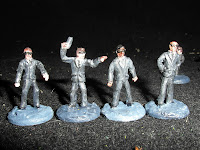
The figures in the photos are all MegaMinis and are from their Modern Civilian range entitled "The Bureau"; they're not the best, even by MegaMini standards, but they'll still get used. All the standing figures are well over 30mm tall when measured from the bottom of their bases to the top of their heads.


Comments, as always,  are welcomed and appreciated.

It is of course always nice to see new followers and if you haven't already been welcomed, then "Welcome",  I hope you find something to interest you.

Saturday, 9 June 2012

Slottas & Stuff

It's been a while since I last had a rant and rather than show my latest MegaMini civilians I've decided to have a general comment about some of my news and views.

Hot off the press comes the news that I've won a competition, nothing major but rather a friendly competition run by Irqan over on his blog-site Plastic Zombie. (http://lrqan.blogspot.co.uk/). Briefly, the competition was to guess which of four people on a photograph was the man himself and the tie-breaker  was a film quote.  If you want to know the quote that i won it with, then head on over to his site, you'll be more than welcome I'm sure. (Also look for his exciting zombie bat-reps - they're set in a prohibition style 1920's and are very entertaining!)
I've ordered and received another e-book: "The Infection" by Craig DiLouie (on the strength of his book "Tooth and Nail" - Highly recommended) from Amazon, I don't think I'll be disappointed.  Whilst in the process of ordering, it was brought to my attention that the third book in Mira Grant's "Newsflesh Trilogy" was due for release (7th June)

The third book in the trilogy is entitled "Blackout" and it's been on my want list ever since I read the first two in the series last year.  What makes Mira Grant's zombie infected world is its believability and even though it is set some twenty years after the apocalypse the zombie threat is still a reality.

I doubt very much if I'll be disappointed  with this third book of the Trilogy and I can't recommend the first book "Feed" highly enough.  If you don't read any other zombie novels, then read "Feed" (and "Tooth and Nail".

A comment was made on  a fellow bloggers blog about the size of a figure compared to a vehicle.
The vehicle in question was the Mystery machine I showed a while ago and the figure was a "Copplestone".


I've used two identical Foundry figures in attempt to show the crux of the matter.
Left hand picture, the figure has a washer base, whilst the right hand figure has a slotta base.
I think the photos illustrate perfectly one of the reasons why I hate slotta bases.
To illustrate the point further, how many gamers mount their vehicles on bases ? The photo on the left shows a more accurate representation of the comparative heights of the vehicle and figure, with the vehicle raised on slottas, whilst the photo on the right shows the two figures, with and without a slotta base, side by side.
I know which figure I prefer, but each to their own. As to scale - 28mm is not a scale ! - It really does annoy me that it is reffered to as a scale.  I ask you, who measures their height from their feet to their eyes ?  I take it that 28mm figures are roughly 1/60th scale, i.e. approximately 5mm to 1 foot (Only the Brits can mix and match Imperial and Metric measurements without blushing). If the average height of a man these days is say 6 foot (180cm) then the figure Mac Taylor from Foundry's "Juno's Crew" is over 7 foot tall! (probably along with many of the other "larger than life figures). I don't mind the differences in height that much, although a "28mm" figure  that is 36mm tall is pushing the boundaries a bit.
I understand the many uses slottas can have; that nice rim on the bottom can be used to paint on names, or be colour coded (for instant recognition of rank or whatever) and I use it for squad numbers on my "Blood Bowl" teams and squad identification on my "Space Hulk" terminators. The difference however is that the actual base is black as befits a piece/token for a board game.  I made no attempt to represent grass, rubble or space-ship detritus as there seems to be no point when you have that black rim glaring at you.
My preferred basing materials are shown above left, pennies and washers.  The pennies are slightly thicker than the washers(nearly double) but are cheaper.  The washers I got for £2 a hundred, making them double the cost, but  that hole in the middle allows you to mount figures designed for slotta bases, with a bit of judicious filing. Word of warning: If you're thinking of buying washers, avoid buying them from the chain-store DIY shops a pack of 10 M10 washers (like those above) can cost well over £3 ! Search out local hardware stores that sell them by weight instead.
 Rant Over.

 This week's has been a bit of a ramble and I haven't managed to even show my latest MegaMini civilians and "Bureau" that I've finished (for bureau, read Men in Black), so that will at least give me material for my next blog.
I purposely didn't say next week's blog as I'm attending a family affair over the entire next week-end - it's not just HRH that is celebrating a Diamond anniversary - so my blog may be at best delayed and at worst postponed.

Once more, thanks for taking a look; all comments, rants etc. are of course welcome and if I haven't already welcomed you to my blog then "Welcome and I hope you find something here you like".

Saturday, 2 June 2012

Growing Population

A small contribution this week to the growing population of my city.

The central figure is from " Raven Painting" run by Carl Robson and were bought off e-bay and represents Captain Jack Spaulding from the films "the House of 1000 corpses" and "The Devils Rejects".  I painted him up on a whim. I still have the rest of the gang to paintm including a non-clown version of Captain Jack.

The other two figures are "MegaMinis", from one of their specific civilian packs.

Another two MegaMini civilians.

MegaMinis are not everyone's "cup of tea", but I like them, if only for their variety and as can be seen from the photograph. - Not everyone appears as a Hollywood starlet.

From my point of view, another factor in their favour is their price, at about $12 for 8 figures or around £1 a figure, I'll accept all their shortcomings (well nearly all).


The next two photographs show five out of the eight  figures from MegaMinis' set labelled  "Thugs".

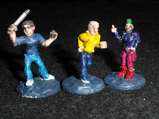
The figure on the left is armed with a single barrelled shotgun, the one in the middle has a length of chain and the right-hand figure has a pool cue.

The left-most chap's head is slightly larger than it should be and does give a cartoony style to the sculpt.  There are several other too in MegaMinis range of Modern Civilians that also suffer this afflicition, but as I couldn't do better, I'm not one to complain. I guess given time and energy, it would be an easy enough task to graft on new heads.
Fairly obvious what the left hand figure is wielding, but the right hand chap has a knuckleduster in his left hand. 

I put it down to the ineptitude of the photographer that this isn't distinguishable.

All the Megaminis Packs have eight figures in them and the "Thugs" pack is no different, I just haven't got round to finishing the other three. I have however finished another dozen or so of their civilians and these will be shown next week


A quick final plug for "Broadside 2012" and if you want to know why I'm doing this, then you'll have to
last week's blog.

Finally, thank you for looking and all comments are appreciated and if I haven't already welcomed you to my site, then "Welcome !" -  I hope you'll find something you like.